


Mastering Responsive Tables in Figma
A Step-by-Step Guide


Tables are a crucial part of UI design, but making them responsive can be tricky. In this tutorial, I’ll break it down into easy steps so you can build a fully responsive table in Figma.
Step 1: Create Your Table Cells
To make your table dynamic and scalable, start by creating two types of cells:
Header Cell – Used for column titles.
Table Cell – Used for data entries.
Once you’ve designed these, turn them into components and add variants for numbers, text, and different states (optional). This ensures flexibility when adjusting your table later.
Header Cells Details:
Typography: 14px, bold
Padding: 16px (L&R), 22px (T&B)
Height: 60px Fixed
Width: Fill
🔍 Tip: Organizing your layers properly at this stage will save you time later!

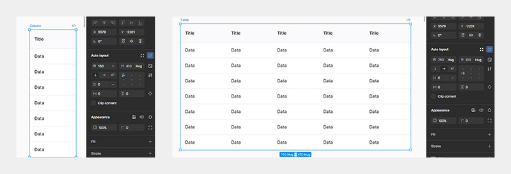
Step 2: Build Your Table Structure
Now it’s time to assemble your table using Auto Layout:
Place your cells into an Auto Layout column (so they resize dynamically).
Repeat this process for each column of your table.
Nest all your columns inside another Auto Layout frame to create the full table.
🔍 Tip: Make sure the width for your cells and columns are set to fill.
Step 3: Make It Fully Responsive
To ensure your table scales properly:
Set "Fill" for both cells and columns so they expand.
Add a stroke for visual clarity.
Apply an 8px corner radius for a polished look.
Enable "Clip Content" to keep things tidy.
Once done, try resizing the table—it should now adjust dynamically without breaking! 🎉
🔍 Tip: Set the text in your cells to truncate so that it doesn’t get cut off when re-sizing.
Final Thoughts
With this method, you’ve built a scalable, reusable table that adapts to different screen sizes. This approach not only improves efficiency in Figma but also makes collaboration with developers much smoother.
Give it a try! Did this tutorial help? Let me know in the comments. 🚀
Wonderful content!
I learn so much better with pictures.
Thank you John!